/Users/raylai/Library/Caches/org.R-project.R/R/reticulate/uv/cache/archive-v0/n27kI_pu2kgd7cyXmF2Fh/lib/python3.11/site-packages/backtesting/_plotting.py:55: UserWarning: Jupyter Notebook detected. Setting Bokeh output to notebook. This may not work in Jupyter clients without JavaScript support, such as old IDEs. Reset with `backtesting.set_bokeh_output(notebook=False)`.
warnings.warn('Jupyter Notebook detected. 'Moving Averages - Bands and Channels
For Moving Averages Part (1), please visit here
The concept of Bands and Channels is to improve the reliability of the signal without changing too much on the trend system profile. The idea is to delay the entry point, with the benefit of seeking for more confirmation of trend change. However, the trade-off would be a lower profit per trade, as the entry is delayed.
As a system developer, it is important to understand this trade-off, as it will impact the objective that we are optimising for.
Why delaying entry would benefit the win rate?
This is based on the rationale that at the point of trend change, it has the biggest uncertainty. For example, if the trend is flat, it is hard to tell whether the trend is actually changing or just choppy.
Delaying the entry would give us more confident that, at the entry point, the new trend has begun.
Different bands and channels
There are many different ways to create a band. Again, the profile of a system rarely change. Adding a band component, in whatever way, should achieve similar results, but with a different combination of risk and reward.
The following are some of the more common ones:
Bands formed by Highs and Lows
Keltner Channels
Percentage Bands
Volatility Bands
Bollinger Bands
Modified Bollinger Bands
Entry Rule
The general form of entry rule is as follow:
Buy (close out shorts and go long) when the prices close above the upper band
Sell Short (close out longs and go short) when the prices close below the lower band
For simplicity, no position sizing is involved. We will either buy 1 unit of ETF or 1 contract. The focus is on understanding the entry signal. There will be no stops or profit-taking.
Evaluation of performance
We will compare the Return %, Win rate, and Profit factor based on the same universe we defined here.
universe = [
  "IYY", "SPY", "QQQ", "IWM",
  "FXI", "EWJ", "VNM", "INDA", "EWY", "EWT",
  "EWQ", "EWI", "EWG", "EWU",
  "ARGT", "EWW", "EWZ",
  "SHY", "TLT",
  "GC=F", "SI=F", "HG=F", "CL=F", "NG=F", "HO=F", "RB=F", "CT=F", "ZC=F", "ZS=F",
  "ZL=F", "ZW=F", "SB=F",
  "6A=F", "6B=F", "6C=F", "6E=F", "6J=F", "6S=F", "6N=F", "DX=F"
]

import yfinance as yf

tickers = yf.Tickers(universe)
1. Bands formed by Highs and Lows
This is the most natural way to create a band - by using daily high and low prices. This means, instead of using the n-day moving averages to the closing prices, we use the n-day moving highs and n-day moving lows to create the band.
We use n=45 days for baseline. We expect a trend-following strategy will work in mid-to-long term.
Code
from strategy.HighLowBandsStrategy import HighLowBandsStrategy
from strategy.MovingAverageStrategy import MovingAverageStrategy
Code
start = "2000-01-01"
end = "2025-03-30"

results_bands = []
results_benchmark = []

for ticker in universe:

  data = tickers.tickers[ticker].history(start=start, end=end)

  bt_bands = Backtest(data,
                HighLowBandsStrategy,
                cash=10_000)
  stats_bands = bt_bands.run(n=45)
  results_bands.append(stats_bands)

  if (ticker == "SPY"):
    bt_bands.plot()

  bt_benchmark = Backtest(data,
                MovingAverageStrategy,
                cash=10_000)
  stats_benchmark = bt_benchmark.run(n=45)
  results_benchmark.append(stats_benchmark)
/Users/raylai/Library/Caches/org.R-project.R/R/reticulate/uv/cache/archive-v0/n27kI_pu2kgd7cyXmF2Fh/lib/python3.11/site-packages/bokeh/util/serialization.py:242: UserWarning: no explicit representation of timezones available for np.datetime64
return convert(array.astype("datetime64[us]"))Show the code
returns_bands = list(map(lambda x: x["Return [%]"], results_bands))
returns_benchmark = list(map(lambda x: x["Return [%]"], results_benchmark))

returns_df = pd.DataFrame({'Universe': universe,
                           'Bands Returns': returns_bands,
                           'MA Trend Returns': returns_benchmark
                           })
returns_df = pd.melt(returns_df,
                id_vars="Universe",
                value_vars=["Bands Returns", "MA Trend Returns"],
                var_name="Strategy",
                value_name="Returns")
returns_df.sort_values("Returns", ascending=False, inplace=True)

fig, ax = plt.subplots()

sns.barplot(returns_df, x="Universe", y="Returns", hue="Strategy", ax=ax)

ax.tick_params(axis='x', rotation=45, labelsize=8)
ax.set_title("Returns from 1990 to 2025 by using 45-day MA")

plt.show()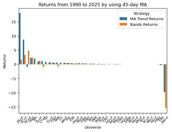
Comparing trend length for different asset classes and their performance
All we want to know is how is it performing with different lengths of the band. Trend-following strategy is expected to work for long term trend. By testing different length of moving averages, we can see how the performance changes.
Code
ma_lengths = [5, 10, 20, 40, 80, 120, 200]
bands_results = []
benchmark_results = []

start = "2015-01-01"
end = "2025-03-30"

for ticker in universe:

  ticker_bands_result = []
  ticker_benchmark_result = []

  for ma in ma_lengths:

    data = tickers.tickers[ticker].history(start=start, end=end)

    bt_bands = Backtest(data,
                  HighLowBandsStrategy,
                  cash=10_000)
    stats_bands = bt_bands.run(n=ma)
    ticker_bands_result.append(stats_bands)

    bt_benchmark = Backtest(data,
                  MovingAverageStrategy,
                  cash=10_000)
    stats_benchmark = bt_benchmark.run(n=ma)
    ticker_benchmark_result.append(stats_benchmark)

  bands_results.append(ticker_bands_result)
  benchmark_results.append(ticker_benchmark_result)
Code
noise = pd.read_csv("./data/noise-40-day-2015-2025.csv")
noise.set_index("symbol", inplace=True)
HL_bands_all_performances = []
benchmark_all_performances = []

for i, symbol in enumerate(universe):

  n = []
  return_pcts = []
  win_rates = []
  profit_factors = []
  num_trades = []
  sharpe_ratios = []
  expectancies = []

  for ma_result in bands_results[i]:
    n.append(ma_result._strategy.n)
    return_pcts.append(ma_result["Return [%]"])
    win_rates.append(ma_result["Win Rate [%]"])
    profit_factors.append(ma_result["Profit Factor"])
    num_trades.append(ma_result["# Trades"])
    sharpe_ratios.append(ma_result["Sharpe Ratio"])
    expectancies.append(ma_result["Expectancy [%]"])

  result_df = pd.DataFrame({
    "Length": n,
    "Return %": return_pcts,
    "Win Rate": win_rates,
    "Profit Factors": profit_factors,
    "Number of Trades": num_trades,
    "Sharpe Ratio": sharpe_ratios
    })

  result_df["Symbol"] = symbol

  HL_bands_all_performances.append(result_df)

  n = []
  return_pcts = []
  win_rates = []
  profit_factors = []
  num_trades = []
  sharpe_ratios = []
  expectancies = []

  # Benchmarking
  for ma_result in benchmark_results[i]:
    n.append(ma_result._strategy.n)
    return_pcts.append(ma_result["Return [%]"])
    win_rates.append(ma_result["Win Rate [%]"])
    profit_factors.append(ma_result["Profit Factor"])
    num_trades.append(ma_result["# Trades"])
    sharpe_ratios.append(ma_result["Sharpe Ratio"])
    expectancies.append(ma_result["Expectancy [%]"])

  result_df = pd.DataFrame({
    "Length": n,
    "Return %": return_pcts,
    "Win Rate": win_rates,
    "Profit Factors": profit_factors,
    "Number of Trades": num_trades,
    "Sharpe Ratio": sharpe_ratios
    })

  result_df["Symbol"] = symbol

  benchmark_all_performances.append(result_df)

HL_bands_all_performances = pd.concat(HL_bands_all_performances).set_index("Symbol")
HL_bands_all_performances = pd.merge(HL_bands_all_performances, noise, left_index=True, right_index=True)

benchmark_all_performances = pd.concat(benchmark_all_performances).set_index("Symbol")
benchmark_all_performances = pd.merge(benchmark_all_performances, noise, left_index=True, right_index=True)

# Sort by Noise
HL_bands_all_performances.sort_values("efficiency_ratio", ascending=False, inplace=True)
benchmark_all_performances.sort_values("efficiency_ratio", ascending=False, inplace=True)Code
fig, ax = plt.subplots(figsize=(17, 10))

sns.barplot(HL_bands_all_performances,
            x="Symbol",
            y="Profit Factors",
            hue = "Length",
            palette="Blues",
            ax=ax)

ax.tick_params(axis='x', rotation=45, labelsize=8)
ax.set_title("Profit Factor from 2015 to 2025 by different levels of MAs")
ax.set_xlabel("Asset (Rank by Efficiency Ratio)")
ax.axhline(y = 1, c = "red")

plt.show()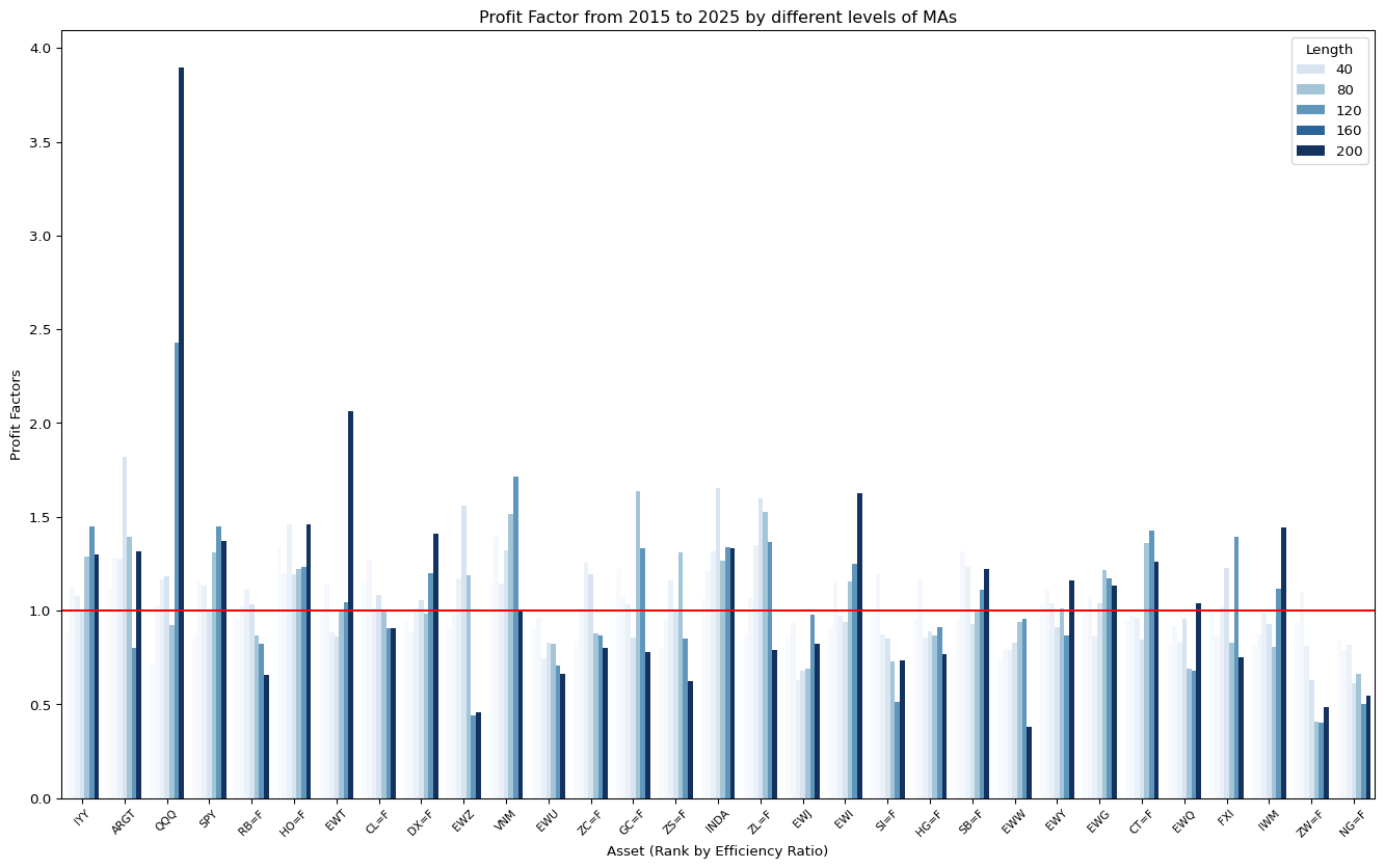
Code
fig, ax = plt.subplots(figsize=(17, 10))

sns.barplot(HL_bands_all_performances,
            x="Symbol",
            y="Win Rate",
            hue = "Length",
            palette="Blues",
            ax=ax)

ax.tick_params(axis='x', rotation=45, labelsize=8)
ax.set_title("Win Rate from 2015 to 2025 by different levels of MAs")
ax.set_xlabel("Asset (Rank by Efficiency Ratio)")

plt.show()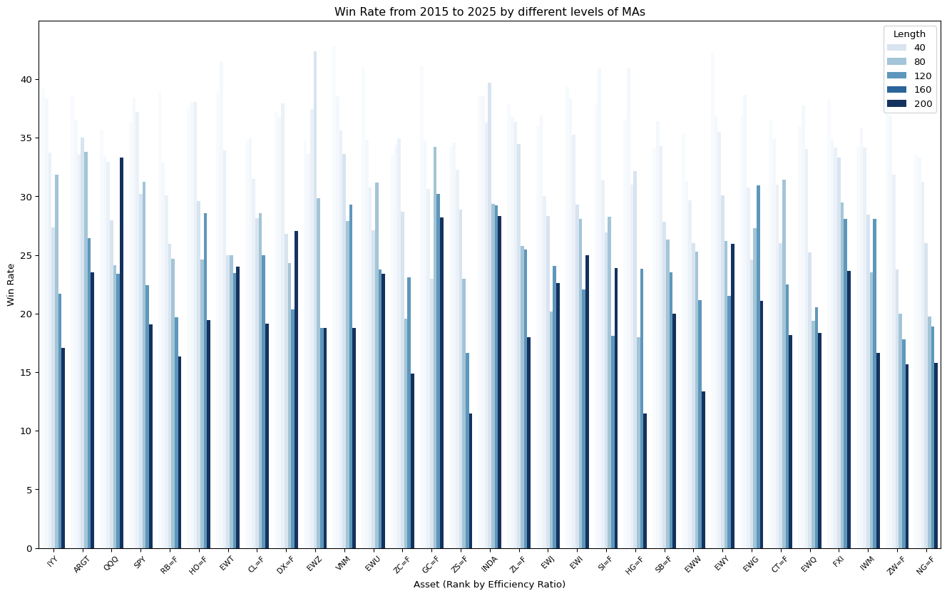
Code
fig, ax = plt.subplots(figsize=(17, 10))

sns.barplot(HL_bands_all_performances,
            x="Symbol",
            y="Number of Trades",
            hue = "Length",
            palette="Blues",
            ax=ax)

ax.tick_params(axis='x', rotation=45, labelsize=8)
ax.set_title("Number of trades from 2015 to 2025 by different levels of MAs")
ax.set_xlabel("Asset (Rank by Efficiency Ratio)")

plt.show()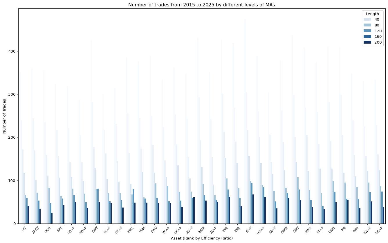
Below is a comparison between the trending asset (IYY) and Noisy asset (IWM)
| Symbol | IWM | IYY | ||||||
|---|---|---|---|---|---|---|---|---|
| data | Bands | Benchmark | Bands | Benchmark | ||||
| variable | Profit Factors | Return % | Profit Factors | Return % | Profit Factors | Return % | Profit Factors | Return % |
| Length | ||||||||
| Loading ITables v2.2.5 from the internet... (need help?) | ||||||||
Learnings
From the result, we see how bands work - - Because it slows down the entry, it helps to improve the profit factor in noisy market. This is because the entry point is not as ideal as with the moving average of close. - However, the trade-off is the performance worsen in trending market - Also, it helps to improve the profit factor by using short timeframe.
2. Keltner Channels
We have learnt that a High-Low band can improve the profit factor for noisy market, but worsen the one in trending market. Are there other bands that could work better?
Working better means: Less trade-off that we need to take, although that is unavoidable.
Here we will explore the Keltner Channel
- Keltner Channel
-
Keltner channel is a variation of the original band calculation, invented by Keltner1
Note: The Average Daily Range can be swapped to using Average True Range
The calculation are as follows: \[ \begin{aligned} \text{Average True Range} \qquad &\text{ATR}_t(14)=\text{AVG}(\text{MAX}[H_t−L_t, ∣H_t−C_t∣,∣L_t−C_t∣], 14) \\ \text{10-day Moving Average} \qquad &MA_t=\text{Average}(C_t, 10) \\ \text{Upper Band} \qquad &UB_t=MA_t+AP_t \\ \text{Lower Band} \qquad &LB_t=MA_t-AP_t \end{aligned} \]
Code
from importlib import reload
import strategy.KeltnerChannelStrategy

reload(strategy.KeltnerChannelStrategy)

from strategy.KeltnerChannelStrategy import KeltnerChannelStrategy
Code
start = "2000-01-01"
end = "2025-03-30"

results_keltner_channels = []

for ticker in universe:

  data = tickers.tickers[ticker].history(start=start, end=end)

  bt_keltner_channels = Backtest(data,
                KeltnerChannelStrategy,
                cash=10_000)

  stats_keltner_channels = bt_keltner_channels.run(n=45)

  if (ticker == "SPY"):
    bt_keltner_channels.plot()

  results_keltner_channels.append(stats_keltner_channels)
/Users/raylai/Library/Caches/org.R-project.R/R/reticulate/uv/cache/archive-v0/n27kI_pu2kgd7cyXmF2Fh/lib/python3.11/site-packages/bokeh/util/serialization.py:242: UserWarning: no explicit representation of timezones available for np.datetime64
return convert(array.astype("datetime64[us]"))Show the code
returns_keltner_channels = list(map(lambda x: x["Return [%]"], results_keltner_channels))

returns_df = pd.DataFrame({'Universe': universe,
                           'Keltner Channels Returns': returns_keltner_channels,
                           'MA Trend Returns': returns_benchmark,
                           })
returns_df = pd.melt(returns_df,
                id_vars="Universe",
                value_vars=["Keltner Channels Returns", "MA Trend Returns"],
                var_name="Strategy",
                value_name="Returns")
returns_df.sort_values("Returns", ascending=False, inplace=True)

fig, ax = plt.subplots()

sns.barplot(returns_df, x="Universe", y="Returns", hue="Strategy", ax=ax)

ax.tick_params(axis='x', rotation=45, labelsize=8)
ax.set_title("Returns from 1990 to 2025 by using 45-day MA")

plt.show()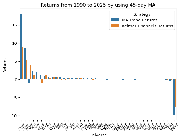
Comparing trend length for different asset classes and their performance
Here is the same optimisation procedures for the Keltner channel method.
Code
ma_lengths = [5, 10, 20, 40, 80, 120, 200]
keltner_channel_results = []
keltner_channel_instances = []

start = "2015-01-01"
end = "2025-03-30"

for ticker in universe:

  ticker_keltner_channel_results = []
  ticker_keltner_instances = []

  for ma in ma_lengths:

    data = tickers.tickers[ticker].history(start=start, end=end)

    bt_keltner = Backtest(data,
                  KeltnerChannelStrategy,
                  cash=10_000)
    stats_keltner = bt_keltner.run(n=ma)
    ticker_keltner_channel_results.append(stats_keltner)
    ticker_keltner_instances.append(bt_keltner)


  keltner_channel_results.append(ticker_keltner_channel_results)
  ticker_keltner_instances.append(bt_keltner)
Code
noise = pd.read_csv("./data/noise-40-day-2015-2025.csv")
noise.set_index("symbol", inplace=True)
keltner_channel_all_performances = []

for i, symbol in enumerate(universe):

  n = []
  return_pcts = []
  win_rates = []
  profit_factors = []
  num_trades = []
  sharpe_ratios = []
  expectancies = []

  for ma_result in keltner_channel_results[i]:
    n.append(ma_result._strategy.n)
    return_pcts.append(ma_result["Return [%]"])
    win_rates.append(ma_result["Win Rate [%]"])
    profit_factors.append(ma_result["Profit Factor"])
    num_trades.append(ma_result["# Trades"])
    sharpe_ratios.append(ma_result["Sharpe Ratio"])
    expectancies.append(ma_result["Expectancy [%]"])

  result_df = pd.DataFrame({
    "Length": n,
    "Return %": return_pcts,
    "Win Rate": win_rates,
    "Profit Factors": profit_factors,
    "Number of Trades": num_trades,
    "Sharpe Ratio": sharpe_ratios
    })

  result_df["Symbol"] = symbol

  keltner_channel_all_performances.append(result_df)

keltner_channel_all_performances = pd.concat(keltner_channel_all_performances).set_index("Symbol")
keltner_channel_all_performances = pd.merge(keltner_channel_all_performances, noise, left_index=True, right_index=True)

# Sort by Noise
keltner_channel_all_performances.sort_values("efficiency_ratio", ascending=False, inplace=True)Code
fig, ax = plt.subplots(figsize=(17, 10))

sns.barplot(keltner_channel_all_performances,
            x="Symbol",
            y="Profit Factors",
            hue = "Length",
            palette="Blues",
            ax=ax)

ax.tick_params(axis='x', rotation=45, labelsize=8)
ax.set_title("Profit Factor from 2015 to 2025 by different levels of MAs")
ax.set_xlabel("Asset (Rank by Efficiency Ratio)")
ax.axhline(y = 1, c = "red")

plt.show()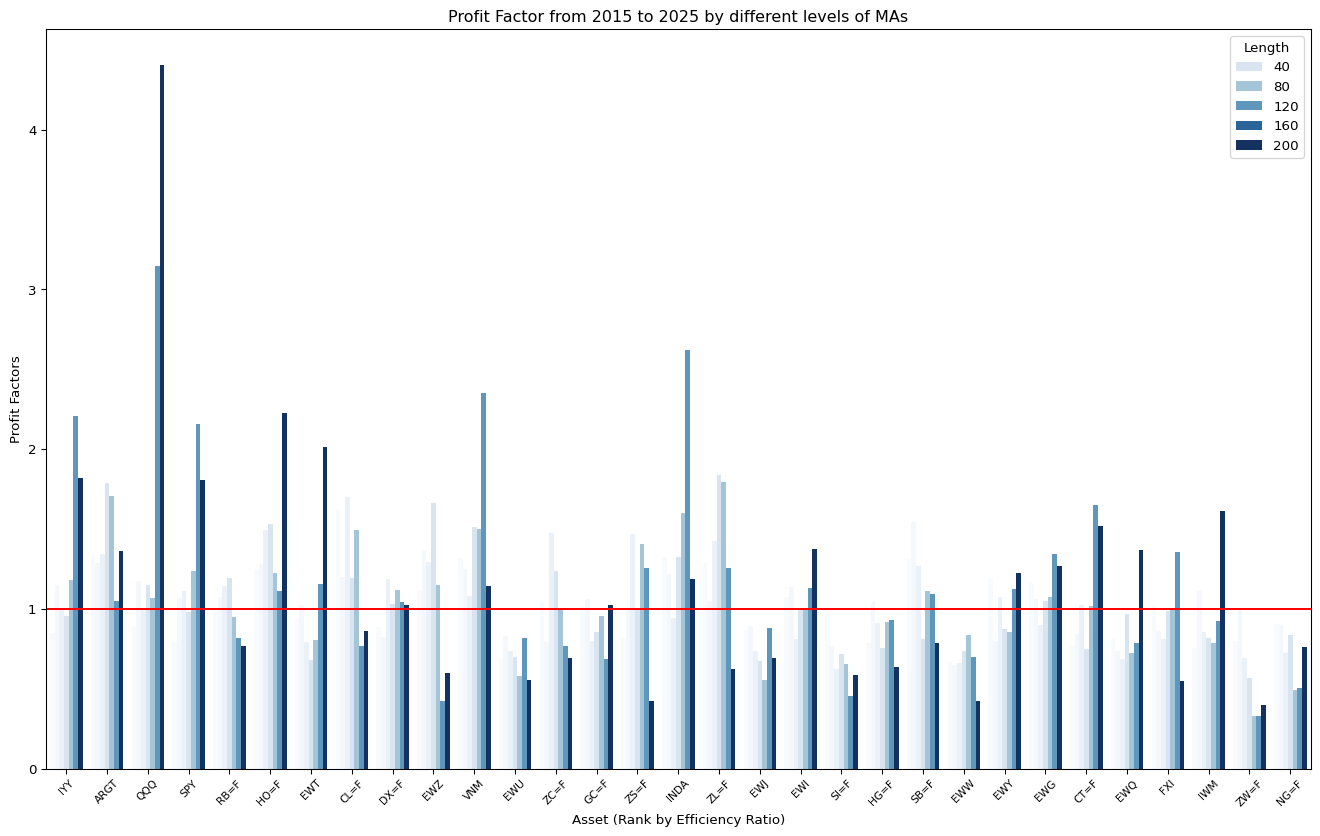
Code
fig, ax = plt.subplots(figsize=(17, 10))

sns.barplot(keltner_channel_all_performances,
            x="Symbol",
            y="Win Rate",
            hue = "Length",
            palette="Blues",
            ax=ax)

ax.tick_params(axis='x', rotation=45, labelsize=8)
ax.set_title("Win Rate from 2015 to 2025 by different levels of MAs")
ax.set_xlabel("Asset (Rank by Efficiency Ratio)")

plt.show()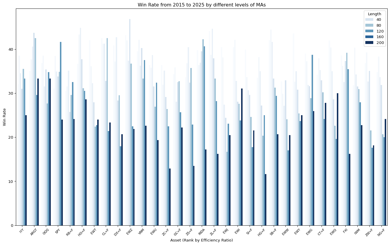
Code
fig, ax = plt.subplots(figsize=(17, 10))

sns.barplot(keltner_channel_all_performances,
            x="Symbol",
            y="Number of Trades",
            hue = "Length",
            palette="Blues",
            ax=ax)

ax.tick_params(axis='x', rotation=45, labelsize=8)
ax.set_title("Number of trades from 2015 to 2025 by different levels of MAs")
ax.set_xlabel("Asset (Rank by Efficiency Ratio)")

plt.show()
Below is a comparison between the trending asset (IYY) and Noisy asset (IWM)
| Symbol | IWM | IYY | ||||||
|---|---|---|---|---|---|---|---|---|
| data | Keltner Ch. | Benchmark | Keltner Ch. | Benchmark | ||||
| variable | Profit Factors | Return % | Profit Factors | Return % | Profit Factors | Return % | Profit Factors | Return % |
| Length | ||||||||
| Loading ITables v2.2.5 from the internet... (need help?) | ||||||||
Also comparing Keltner with bands:
| Symbol | IWM | IYY | ||||||
|---|---|---|---|---|---|---|---|---|
| data | Keltner Ch. | Bands | Keltner Ch. | Bands | ||||
| variable | Profit Factors | Return % | Profit Factors | Return % | Profit Factors | Return % | Profit Factors | Return % |
| Length | ||||||||
| Loading ITables v2.2.5 from the internet... (need help?) | ||||||||
Code
all_performances = pd.concat([keltner_channel_all_performances,
                              HL_bands_all_performances,
                              benchmark_all_performances]).reset_index()

melted_performances = pd.melt(all_performances,
                        id_vars=["Symbol", "Length", "data"],
                        value_vars=['Return %',
                                    'Profit Factors'],
                        value_name='metric')
melted_performances['data'] = pd.Categorical(melted_performances['data'], ["Keltner Ch.", "Bands", "Benchmark"])

# Draw a nested boxplot to show bills by day and time
fig, ax = plt.subplots(figsize=(17, 10))

sns.boxplot(x="Length", y="metric",
            hue="data", palette="Blues",
            data=melted_performances.query('variable == "Profit Factors"'),
            ax=ax)
sns.despine(offset=10, trim=True)

ax.set_title("Profit factor variation across strategies and assets")
ax.set_xlabel("Length of MA")
ax.set_ylabel("Profit Factor")

plt.show()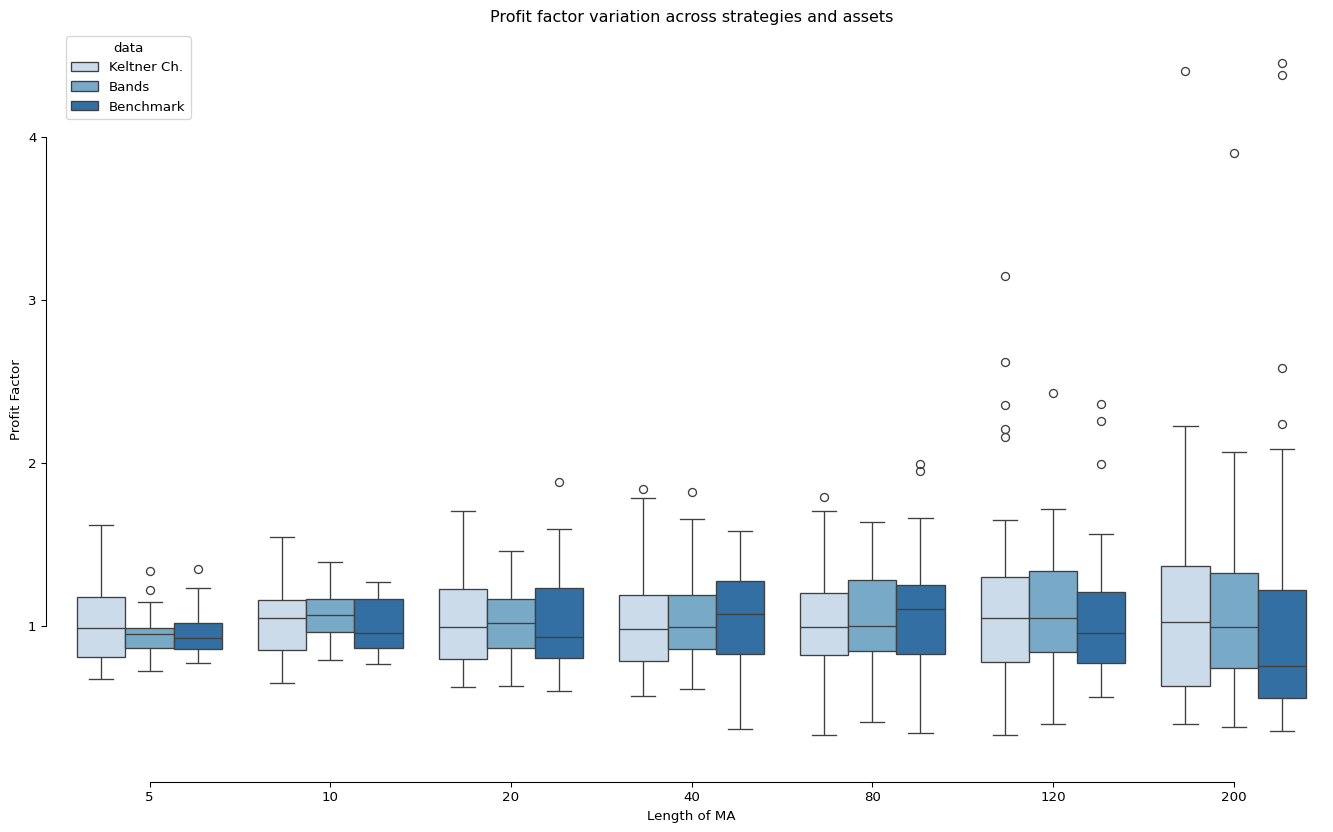
Learnings
We found that for trending assets, Keltner channel performs better (in Profit Factor) than Benchmark (Moving average trend) in the longest MA. However, for noisy asset, the performance is unstable.
3. Percentage Band
Percentage band is another easy way to construct the band. It is done by adding or subtracting the same percentage of price from the moving averages or the yesterday’s closing price \[ \begin{aligned} \text{(Upper Band)} \qquad &B_U=(1+c) \times MA_t \\ \text{(Lower Band)} \qquad &B_L=(1+c) \times MA_t \end{aligned} \]
For simplicity, let’s try to set the band to 3%.
Code
from importlib import reload
import strategy.PercentageBandStrategy

reload(strategy.PercentageBandStrategy)

from strategy.PercentageBandStrategy import PercentageBandStrategy
Code
start = "2000-01-01"
end = "2025-03-30"

results_percentage_bands = []

for ticker in universe:

  data = tickers.tickers[ticker].history(start=start, end=end)

  bt_percentage_bands = Backtest(data,
                PercentageBandStrategy,
                cash=10_000)

  stats_percentage_bands = bt_percentage_bands.run(n=45)

  if (ticker == "SPY"):
    bt_percentage_bands.plot()

  results_percentage_bands.append(stats_percentage_bands)
/Users/raylai/Library/Caches/org.R-project.R/R/reticulate/uv/cache/archive-v0/n27kI_pu2kgd7cyXmF2Fh/lib/python3.11/site-packages/bokeh/util/serialization.py:242: UserWarning: no explicit representation of timezones available for np.datetime64
return convert(array.astype("datetime64[us]"))Show the code
returns_percentage_bands = list(map(lambda x: x["Return [%]"], results_percentage_bands))

returns_df = pd.DataFrame({'Universe': universe,
                           '3% Percentage Bands Returns': returns_percentage_bands,
                           'MA Trend Returns': returns_benchmark,
                           })
returns_df = pd.melt(returns_df,
                id_vars="Universe",
                value_vars=["3% Percentage Bands Returns", "MA Trend Returns"],
                var_name="Strategy",
                value_name="Returns")
returns_df.sort_values("Returns", ascending=False, inplace=True)

fig, ax = plt.subplots()

sns.barplot(returns_df, x="Universe", y="Returns", hue="Strategy", ax=ax)

ax.tick_params(axis='x', rotation=45, labelsize=8)
ax.set_title("Returns from 2000 to 2025 by using 45-day MA")

plt.show()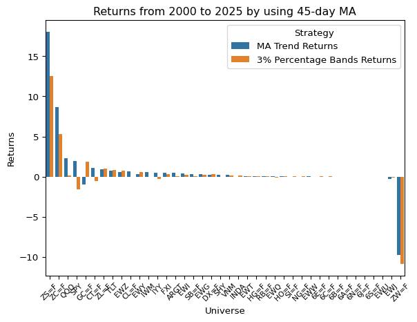
Comparing trend length for different asset classes and their performance
Here is the same optimisation procedures for the Keltner channel method.
Code
ma_lengths = [5, 10, 20, 40, 80, 120, 200]
percentage_bands_results = []
percentage_bands_instances = []

start = "2015-01-01"
end = "2025-03-30"

for ticker in universe:

  ticker_percentage_bands_results = []
  ticker_percentage_bands_instances = []

  for ma in ma_lengths:

    data = tickers.tickers[ticker].history(start=start, end=end)

    bt_keltner = Backtest(data,
                  KeltnerChannelStrategy,
                  cash=10_000)
    stats_keltner = bt_keltner.run(n=ma)
    ticker_percentage_bands_results.append(stats_keltner)
    ticker_percentage_bands_instances.append(bt_keltner)


  percentage_bands_results.append(ticker_percentage_bands_results)
  percentage_bands_instances.append(ticker_percentage_bands_instances)
Code
noise = pd.read_csv("./data/noise-40-day-2015-2025.csv")
noise.set_index("symbol", inplace=True)
percentage_bands_all_performances = []

for i, symbol in enumerate(universe):

  n = []
  return_pcts = []
  win_rates = []
  profit_factors = []
  num_trades = []
  sharpe_ratios = []
  expectancies = []

  for ma_result in percentage_bands_results[i]:
    n.append(ma_result._strategy.n)
    return_pcts.append(ma_result["Return [%]"])
    win_rates.append(ma_result["Win Rate [%]"])
    profit_factors.append(ma_result["Profit Factor"])
    num_trades.append(ma_result["# Trades"])
    sharpe_ratios.append(ma_result["Sharpe Ratio"])
    expectancies.append(ma_result["Expectancy [%]"])

  result_df = pd.DataFrame({
    "Length": n,
    "Return %": return_pcts,
    "Win Rate": win_rates,
    "Profit Factors": profit_factors,
    "Number of Trades": num_trades,
    "Sharpe Ratio": sharpe_ratios
    })

  result_df["Symbol"] = symbol

  percentage_bands_all_performances.append(result_df)

percentage_bands_all_performances = pd.concat(percentage_bands_all_performances).set_index("Symbol")
percentage_bands_all_performances = pd.merge(percentage_bands_all_performances, noise, left_index=True, right_index=True)

# Sort by Noise
keltner_channel_all_performances.sort_values("efficiency_ratio", ascending=False, inplace=True)Code
fig, ax = plt.subplots(figsize=(17, 10))

sns.barplot(percentage_bands_all_performances,
            x="Symbol",
            y="Profit Factors",
            hue = "Length",
            palette="Blues",
            ax=ax)

ax.tick_params(axis='x', rotation=45, labelsize=8)
ax.set_title("Profit Factor from 2015 to 2025 by different levels of MAs")
ax.set_xlabel("Asset (Rank by Efficiency Ratio)")
ax.axhline(y = 1, c = "red")

plt.show()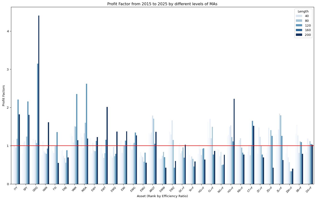
Code
fig, ax = plt.subplots(figsize=(17, 10))

sns.barplot(keltner_channel_all_performances,
            x="Symbol",
            y="Win Rate",
            hue = "Length",
            palette="Blues",
            ax=ax)

ax.tick_params(axis='x', rotation=45, labelsize=8)
ax.set_title("Win Rate from 2015 to 2025 by different levels of MAs")
ax.set_xlabel("Asset (Rank by Efficiency Ratio)")

plt.show()
Code
fig, ax = plt.subplots(figsize=(17, 10))

sns.barplot(keltner_channel_all_performances,
            x="Symbol",
            y="Number of Trades",
            hue = "Length",
            palette="Blues",
            ax=ax)

ax.tick_params(axis='x', rotation=45, labelsize=8)
ax.set_title("Number of trades from 2015 to 2025 by different levels of MAs")
ax.set_xlabel("Asset (Rank by Efficiency Ratio)")

plt.show()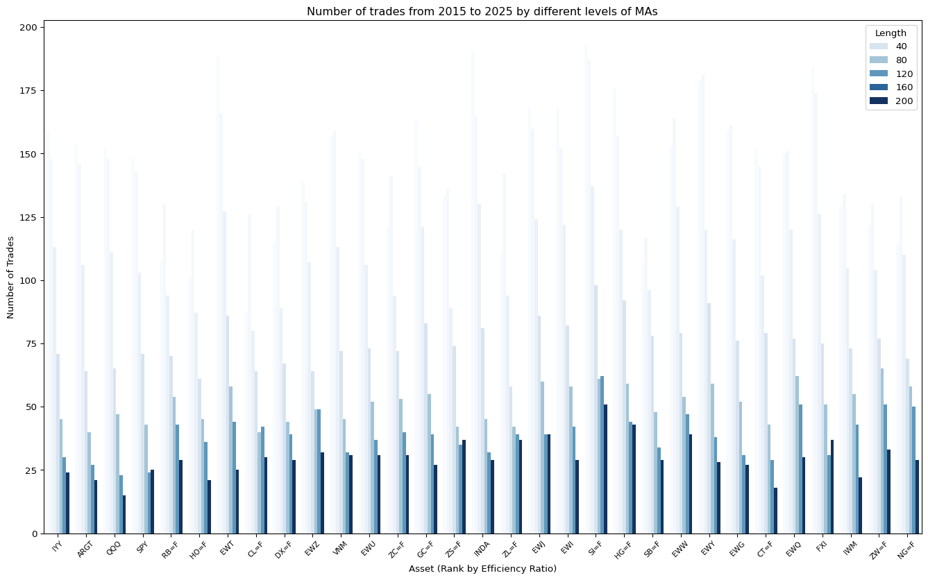
Below is a comparison between the trending asset (IYY) and Noisy asset (IWM)
| Symbol | IWM | IYY | ||||||
|---|---|---|---|---|---|---|---|---|
| data | 3% Bands | Benchmark | 3% Bands | Benchmark | ||||
| variable | Profit Factors | Return % | Profit Factors | Return % | Profit Factors | Return % | Profit Factors | Return % |
| Length | ||||||||
| Loading ITables v2.2.5 from the internet... (need help?) | ||||||||
Also comparing 3% Bands with bands:
| Symbol | IWM | IYY | ||||||
|---|---|---|---|---|---|---|---|---|
| data | 3% Bands | Bands | 3% Bands | Bands | ||||
| variable | Profit Factors | Return % | Profit Factors | Return % | Profit Factors | Return % | Profit Factors | Return % |
| Length | ||||||||
| Loading ITables v2.2.5 from the internet... (need help?) | ||||||||
Code
all_performances = pd.concat([percentage_bands_all_performances,
                              keltner_channel_all_performances,
                              HL_bands_all_performances,
                              benchmark_all_performances]).reset_index()

melted_performances = pd.melt(all_performances,
                        id_vars=["Symbol", "Length", "data"],
                        value_vars=['Return %',
                                    'Profit Factors'],
                        value_name='metric')
melted_performances['data'] = pd.Categorical(melted_performances['data'], ["3% Bands", "Keltner Ch.", "Bands", "Benchmark"])

# Draw a nested boxplot to show bills by day and time
fig, ax = plt.subplots(figsize=(17, 10))

sns.boxplot(x="Length", y="metric",
            hue="data", palette="Blues",
            data=melted_performances.query('variable == "Profit Factors"'),
            ax=ax)
sns.despine(offset=10, trim=True)

ax.set_title("Profit factor variation across strategies and assets")
ax.set_xlabel("Length of MA")
ax.set_ylabel("Profit Factor")

plt.show()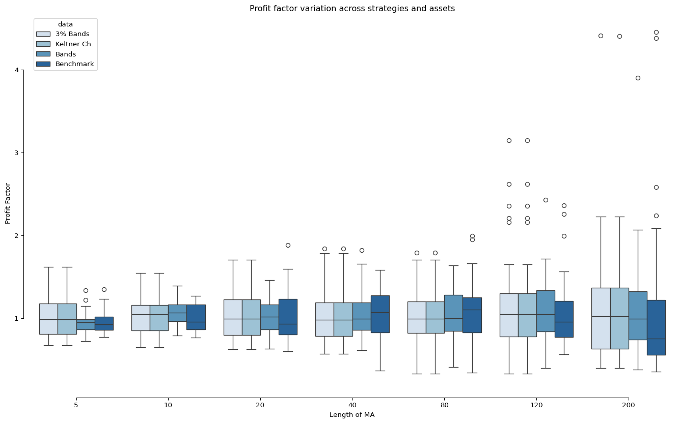
Learnings
The 3% bands actually behave like Keltner Channel, as it is also a volatility based band on premise.
4. Bollinger Bands
Speaking of price volatility banding, Bollinger band is probably one of the most popular price bands.
Bollinger bands, invented by John Bollinger, is essentially a combination of a 20-day moving average with bands formed using 2 standard deviations of the price changes over the say 20-day period.
The idea of having 2 standard deviations is that if price is under normal distribution (which is not - it’s fat tail), it should contain around 95% of data. Hence, Bollinger Bands are designed to be used differently from other banding methods. It is used to identify extreme values. If we use the same crossing entry rules, we will have no entry signal available.
Code
from importlib import reload
import strategy.BollingerBandStrategy

reload(strategy.BollingerBandStrategy)

from strategy.BollingerBandStrategy import BollingerBandStrategy
Code
start = "2000-01-01"
end = "2025-03-30"

results_bollinger_bands = []

for ticker in universe:

  data = tickers.tickers[ticker].history(start=start, end=end)

  bt_bollinger_bands = Backtest(data,
                BollingerBandStrategy,
                cash=10_000)

  stats_bollinger_bands = bt_bollinger_bands.run()

  if (ticker == "SPY"):
    bt_bollinger_bands.plot()

  results_bollinger_bands.append(stats_bollinger_bands)
/Users/raylai/Library/Caches/org.R-project.R/R/reticulate/uv/cache/archive-v0/n27kI_pu2kgd7cyXmF2Fh/lib/python3.11/site-packages/bokeh/util/serialization.py:242: UserWarning: no explicit representation of timezones available for np.datetime64
return convert(array.astype("datetime64[us]"))Code
noise = pd.read_csv("./data/noise-40-day-2015-2025.csv")
noise.set_index("symbol", inplace=True)

return_pcts = []
num_trades = []
win_rates = []
profit_factors = []
num_trades = []
sharpe_ratios = []
expectancies = []
symbols = []


for i, symbol in enumerate(universe):
  return_pcts.append(results_bollinger_bands[i]["Return [%]"])
  win_rates.append(results_bollinger_bands[i]["Win Rate [%]"])
  profit_factors.append(results_bollinger_bands[i]["Profit Factor"])
  num_trades.append(results_bollinger_bands[i]["# Trades"])
  sharpe_ratios.append(results_bollinger_bands[i]["Sharpe Ratio"])
  expectancies.append(results_bollinger_bands[i]["Expectancy [%]"])
  symbols.append(symbol)

bollinger_bands_all_performances = pd.DataFrame({
  "Symbol": symbols,
  "Return %": return_pcts,
  "# Trades": num_trades,
  "Win Rate": win_rates,
  "Profit Factors": profit_factors,
  "Number of Trades": num_trades,
  "Sharpe Ratio": sharpe_ratios
  })

bollinger_bands_all_performances = bollinger_bands_all_performances.set_index("Symbol")
bollinger_bands_all_performances = pd.merge(bollinger_bands_all_performances, noise, left_index=True, right_index=True)

# Sort by Noise
show(bollinger_bands_all_performances,
    ordering=False,
    classes="display compact cell-border",
style="width:100%;margin:auto;font-size:12px")| Return % | # Trades | Win Rate | Profit Factors | Number of Trades | Sharpe Ratio | asset_class | efficiency_ratio | |
|---|---|---|---|---|---|---|---|---|
| Loading ITables v2.2.5 from the internet... (need help?) |
Learnings
As Bollinger bands expand when prices are getting volatile, the price will be rarely to close outside the band range. Hence, it is very hard to generate entry signal by using the same entry rule.
Conversely, Bollinger bands is usually used for mean-reverting strategy. However, this strategy could be very risky, especially when prices are volatile. We will discuss more on this strategy in mean-reverting systems.
Bollinger recommends one improvement is to confirm the downside or upside penetration by using other indicators, primarily those based on volume and market breadth. If the prices are moving lower buy volume is not increasing and negative breadth is not confirming the downside move, then the mean-reverting signal is realistic.
Conclusion
We have introduced 4 banding methods, which they have their own characteristics. I am plotting all the bands in one SPY chart to illustrate the comparison between different bands.
Code
from importlib import reload
import strategy.AllBandsStrategy

reload(strategy.AllBandsStrategy)

from strategy.AllBandsStrategy import AllBandsStrategy
Code
bt_all_bands.plot()/Users/raylai/Library/Caches/org.R-project.R/R/reticulate/uv/cache/archive-v0/n27kI_pu2kgd7cyXmF2Fh/lib/python3.11/site-packages/bokeh/util/serialization.py:242: UserWarning: no explicit representation of timezones available for np.datetime64
return convert(array.astype("datetime64[us]"))We can see that bands are not very different from each other, apart from Bollinger Bands that is closely wrapping the candles within the band. It is also now wrong to say that with certain configurations of parameters, the bands will have similar band width.
It is important to understand the premise of using bands - it is either slow down the entry point to achieve better confirmation, or to find extreme point for mean-reverting strategies. The wider the band, the fewer the signals, but the signals should give you higher win rate. If this cannot be achieved, that it is likely the bandwidth may not fit the asset that you are trading.
However, wide bands do have their downsides, especially for trending assets. You are delaying your entry point, and that means you cannot capture as much of the trend. The average profit per trade will also be smaller. If you use the band of the width as your risk control measure, a wider band also means larger risk per trade, which will lead you to take smaller positions if you are using fixed-dollar position sizing approach.
In this article, we have just explored different methods, but we were all using the same entry rules (Either short or long and stay in the market for all time). We will continue to develop this trend system in later articles.
Footnotes
Chester W. Keltner, How to Make Money in Commodities (Kansas City, MO: The Keltner Statistical Service, 1960). Reference from P. Kaufman, Trading Systems and Methods, 5th edition (pp. 321)↩︎